These scans are from a pamphlet promoting the 1987 animated slacker science fiction epic Royal Space Force: The Wings of Honnêamise.
Written and directed by Hiroyuki Yamaga the film was explicitly intended to elevate the late 80s anime industry, outlined in the proposal Royal Space Force - Project Intentions: A New Wave in a Time of Lost Collaborative Illusions in which -
Okada and Yamaga argued in their proposal for Royal Space Force that what prevented the anime industry from advancing beyond its current level was that it had fallen into a feedback loop with its audience, producing for them a “cul-de-sac” of cute and cool-looking anime content that had the effect of only further reinforcing the more negative and introverted tendencies of many fans, without making a real attempt to connect with them in a more fundamental and personal way
From: Wikipedia > Royal Space Force: The Wings of Honnêamise > Production
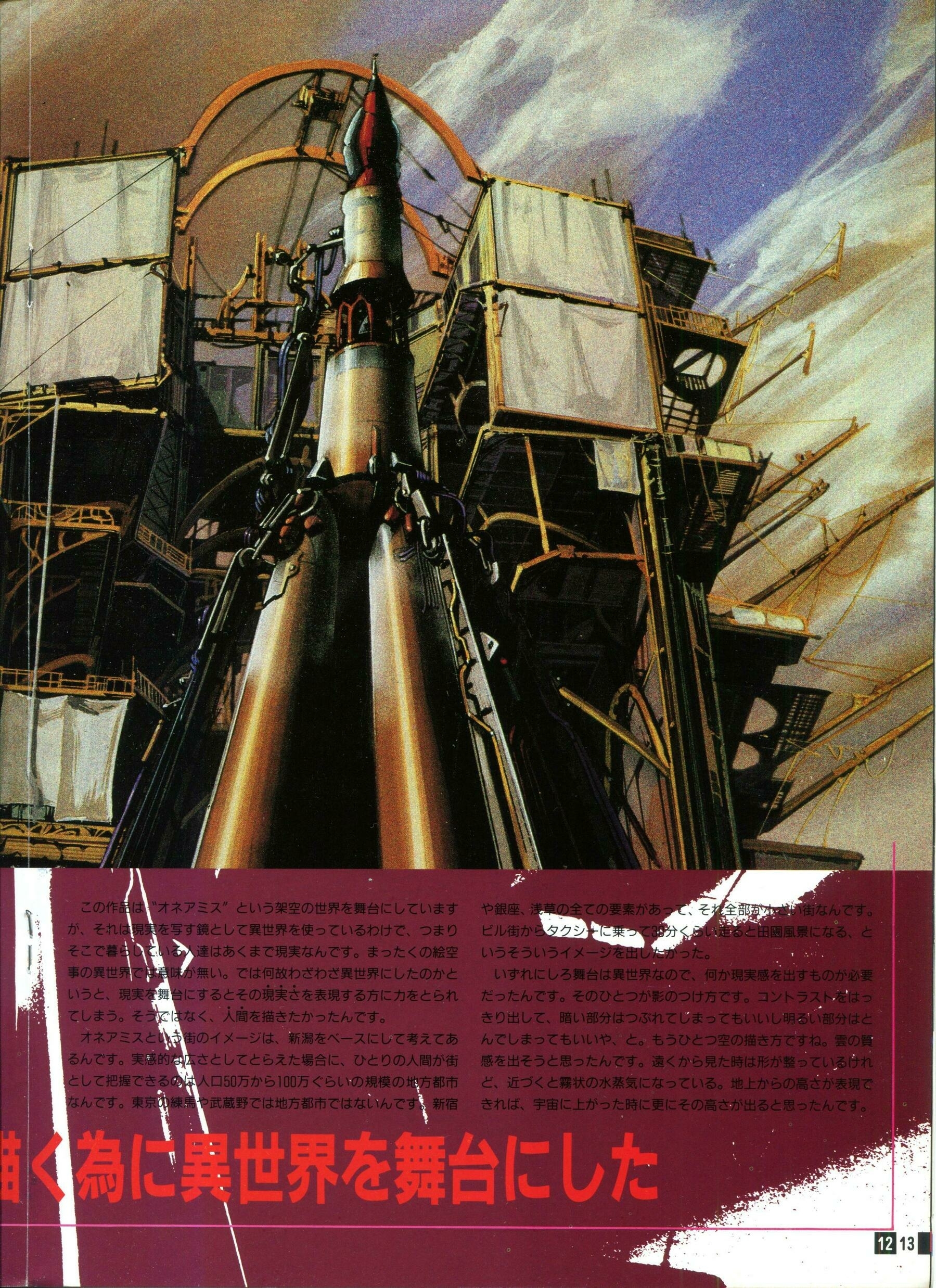
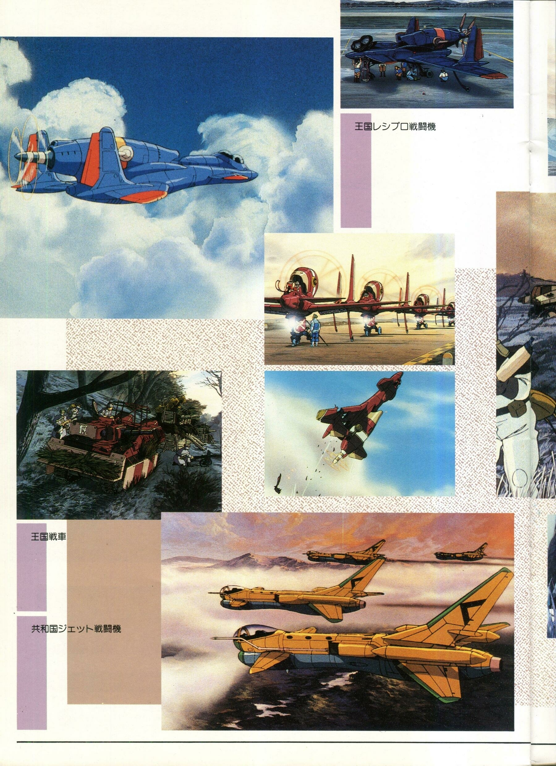
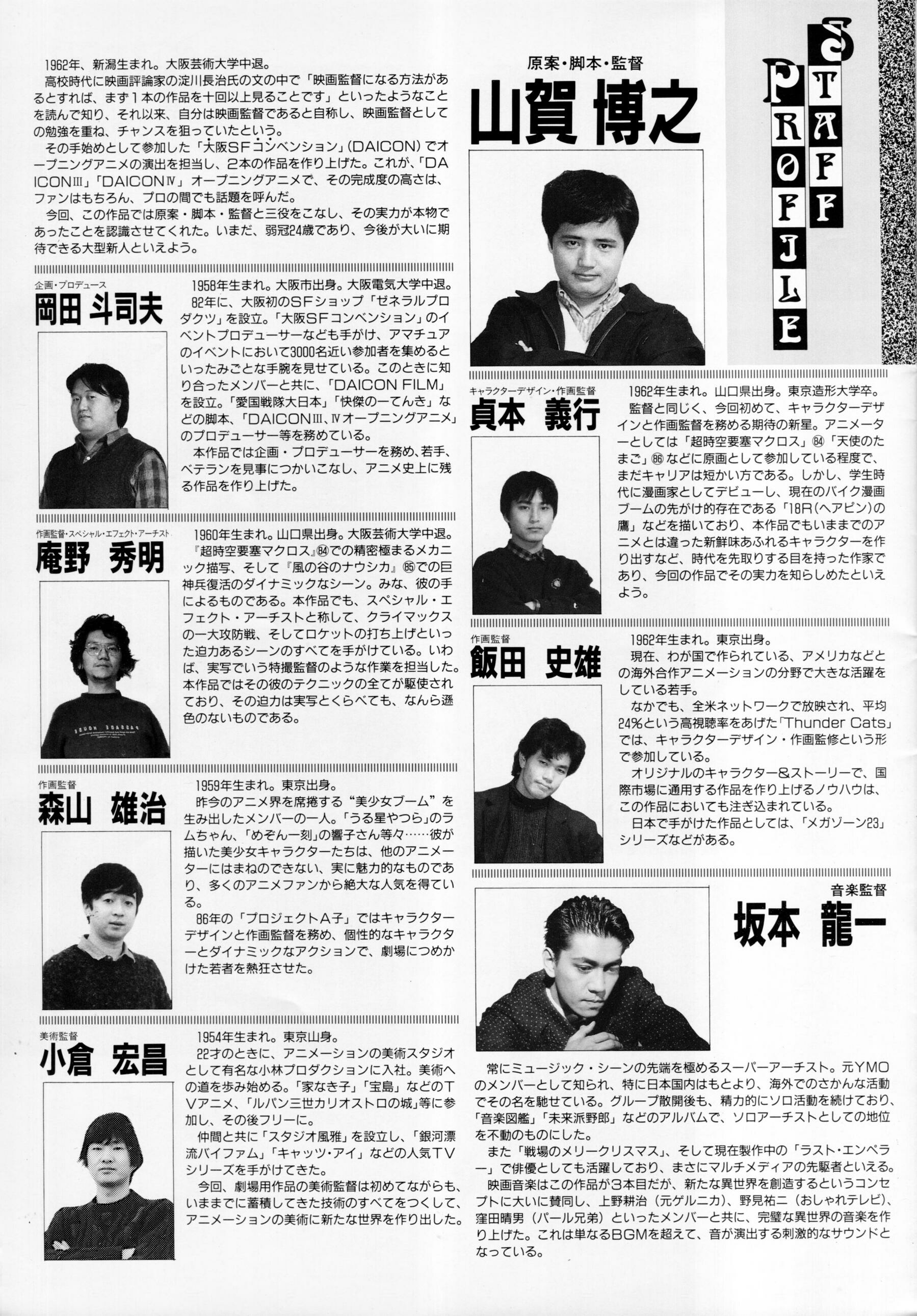
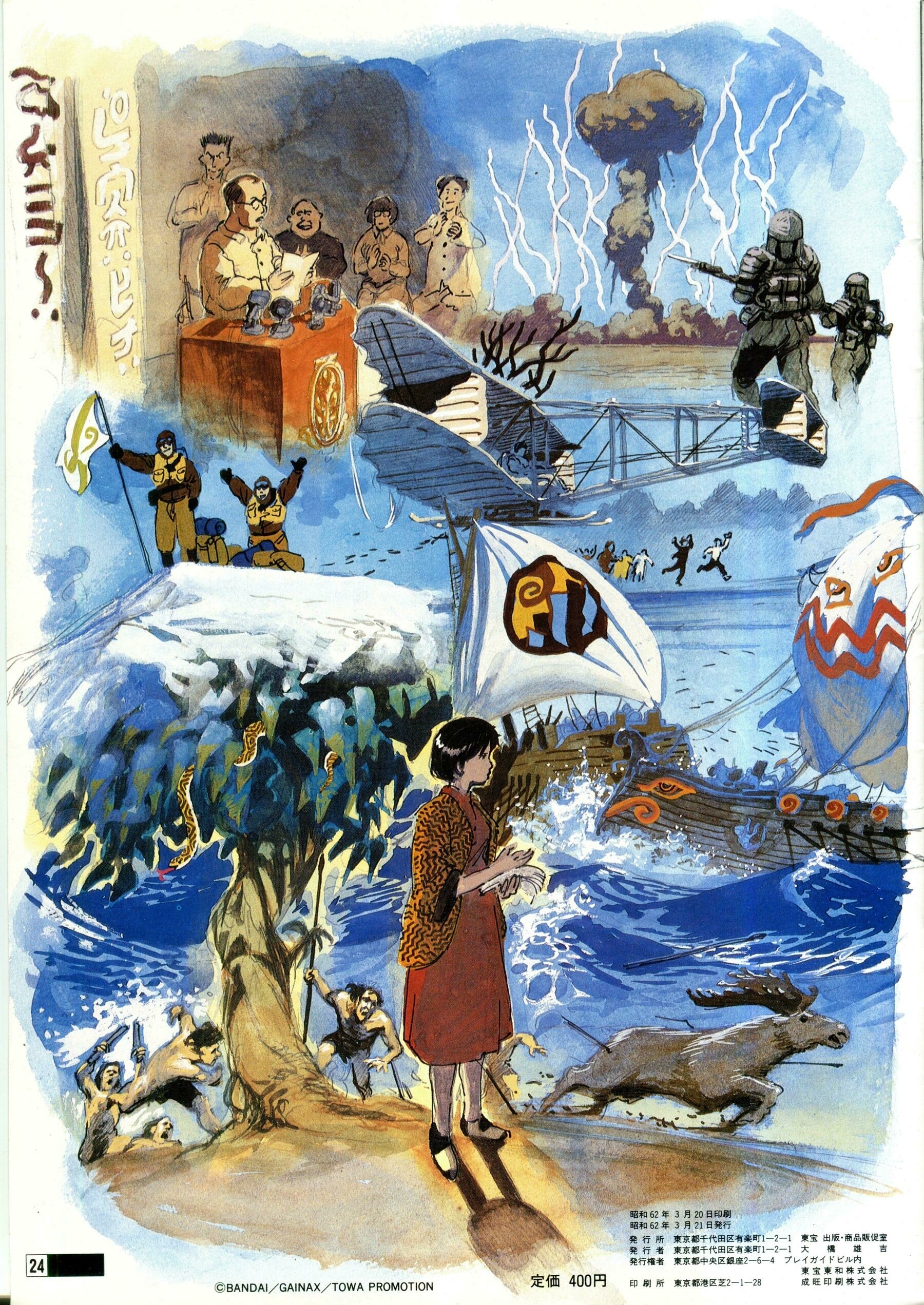
The world building and technical design are a delight to take in. Feathered pompadours, riveted rockets, and canvas spacesuits. A semi-feudal civilisation, post-steampunk tech, wrapped in a self-loathing religious dogma, that feels awfully grounded. The tiniest details feel like they’re not from here. But that they have arrived where they are, in these strangely familiar forms, after generations of unseen iteration. Chief mechanical designer is Hidekai Anno, who would go on to create the inexplicable Evangelion franchise, and the wonderfully strange Shin Godzilla.
This interesting video describes the efforts to reintroduce Tasmanian devils to the mainland and also mentions the close relationship connection between devil populations and invasive feral cat populations. Feral cats kill heaps of mammal wildlife in Australia.
This video from from Calum Cunningham, of the University of Tasmania, goes in to more detail about how the awful face tumour epidemic in Devils has caused a 58% increase in feral cat abundance in the habitats where Devils have declined.
Alas the complicated, but also exciting, APCA is no longer a part of WCAG3. APCA (or Accessible Perceptual Contrast Algorithm) had confronted known flaws in the existing colour contrast formula, quoting from Myndex (Who I think is Andrew Sommers) in Why APCA as a New
Contrast Method?:
WCAG 2.x contrast, SC 1.4.3, and the related understandings and guidelines, were born in an era before smart phones and iPads, when displays were mostly old-school CRT type and websites used core web fonts. But that was a decade and a half ago. Today the contrast guidelines are in need of a complete overhaul due to the massive changes in computer display technology, web content, CSS functionality, and advances in vision science since 2005/2008, when WCAG 2.x was first introduced.
There are a number of reasons that WCAG 2.x contrast is faulty, one of which is the binary pass/fail nature of the SC for a property that does not apply in a binary way across perception nor impairments. Humans are not binary computers, and it is important to understand the non-linear aspects of perception, and to set guidelines that correctly model perception as opposed to “brute forcing” arbitrary values that ultimately do more harm than good.
Not sure what happens to these flaws that APCA was addressing, but it unfortunately it seems that it is not happening.
Going to leave a few more links here for interest’s sake:
A wonderful twitter thread by Dan Hollick, that I’ve chosen to archive as a PDF. There is a link to the original thread in there if you’re so inclined to visit
If a bold, or italics, or hyperlink tag is wrapped around a word, followed by a full stop or a comma. That full stop or comma are also wrapped in that tag, ie.
Waela liked this particular watch station because of its view of <i>the sea.</i>1
There is just something delightfully redundant about an italicised full stop.
This excerpt is from The Jesus Incident By Frank Herbert and Bill Ransom
Note: At some point I intend to order these tools by preference. At the moment I’ve been using the Myndex Research one, just because it ranks highest in search… 🤷
“I would rather say it’s an expression of purpose. It may, if it is good enough, later be judged as art.”
- Madame L’Amic speaking with Charles Eames (also speaking on behalf of Ray Eames), Design Q & A,
Qu’est ce que le design? (What is Design?) at the Musée des Arts Décoratifs, Palais de Louvre, 1972, Transcript at hermanmiller.com